Vincent Van Gogh
Crows Over Wheatfield
1. Description
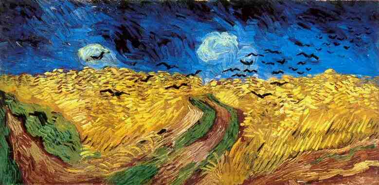
The artist is Vincent Van Gogh and the title of his piece is Wheatfield with Crows. Wheatfiield with Crows was painted in July 1890 and was painted using oil paints. Its is 50.5 cm by 103 cm. Even though people think this was Van Gogh's last painting due to the timing and its ominous subject of the crows and storm that people believe to be hints to his suicide. But none of this is true, although this painting may seem ominous it is also balanced out by the beauty and golden color of the wheatfield. Just like all other Van Gogh pieces it utilizes the same style of smaller strokes of varying color that makes the image seem blocky. The point of this painting is to show the balance between dark and light - good and bad. The crows of course are the bad lurky above the golden and serene wheatfield - the good. the bad doesn't out way the good, but yet the good doesn't out way the bad - there has to be a balance.
2. Analysis
Van Gogh's brush strokes were always bold and never blended into one definite color but remained their own lines and came together as a whole unit - each stroke contributing to the final painting. This style of heavy paint strokes give the painting a very tangible feel. Because they are not smoothed down you can see each well thought out move and brush of the painting. You can see that it is made of paint and is not like a hyper realistic landscape where it look like a picture. The skys go down in a hue of blues where the higher up the darker they are where the clouds are coming in. This use of different hues creates the sense of an infinite skyline.
The heart of this painting is balance and is evident by the amount of each color used the blues contrast the yellows so the darks balance the light. Even the skyline sets up the border for the shift between the moods. The wheat and birds are obviously in motion based on the way each lean and change in size causing the viewers eyes to follow them up the painting.
3. Interpretation
Even though most people read this painting as ominous I don't see it as so and find it soothing as if I were strolling out side and the breeze took my hat and I looked over for it and saw the wind blowing through the wheat. To me I can sense the calm before the storm in this painting but it doesn't seem like the storm is coming it just seems like a calm day. It is an impressionist painting where there is no right or wrong way to feel about it, it is left for you to decide for yourself and for the next person to decide how they feel. I believe the reason Van Gogh painted this was simply because he wanted to, he wanted to paint to take his mind off of the world and to paint how he felt.
4. Judgement
I like this piece, I wouldn't have chose it otherwise I enjoy Van Gogh paintings in general and while considering which one to use it caught my eye because of the way the wheat was painted to look like it was moving and how the yellow and blue seemed like it created two different sides of the painting. The title is doesn't give any illusion to what's it is - it is a wheatfield with crows. It tells you how it is, what you see is what you get.
Rob Shamberger
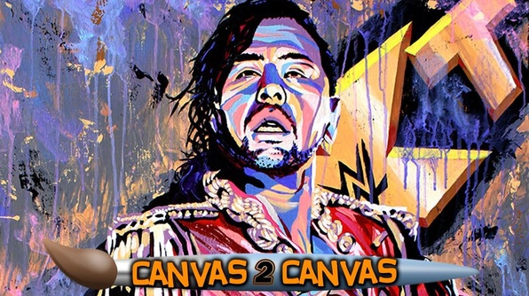
The King of Strong Style
1. Description
Rob Shamberger's art focuses on a wrestling icon and picks colors and painting techniques that he feels complements their style- which leads to a large variety in his works. In my favorite work of his, The King of Strong Style - he uses bright unnatural colors with a solid black for an outline that makes it similar to comic book line art. He never has a definite background but instead uses splashes and rough colors and texture to make the foreground pop out as much as it can. This was painted using various acrillics and by soaking the canvas in the background and watering down the arcilycs for the back as well.
2. Analysis
Similar to Van Gogh, Shamburger also uses bold brush strokes in this painting although this has a more blocky feel than Van Gogh because the colors are more separated. This makes each little detail of skin and wrinkles on clothing stand out- giving it that extra hit of texture and light. The King of Strong Style painting also has no background making it look as if the subject were at a photo shoot.
3. Interpretation. The colors and posing in this work give off a sense of power and overwhelming charisma, both of which are true to the wrestler's personality and fighting style. The way he looks down at you makes you feel smaller and then he seems to become larger than life. The areas that are more cleanly painted make you focus in on the subject to bring a heightened sense of importance to him.
4. Judgement
This is by far one of my favorite pieces by Rob Shambergur, I love the colors, the line work, the different techniques for the foreground and background - I love all of it. The title is a perfect representation of the piece, even if you are unfamiliar with who the subject is. That is because of his power pose and the stronger more predominate colors used to represent his personality.
Tim Burton
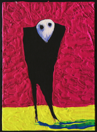
???
1. Description
A single faceless figure stands in the open, waiting, watching, creeping - but what for? Who knows! The painting has an ominous air about it through its subject, use of over saturated colors and pitch black colors. The texture is stunning, and even the lack of it is too - seeing how only the bright colors are given a smeared heavy effect while the black and white remain flat and lifeless.
2. Analysis
Tim Burton's' works are always much more macabre than other artists, even when they are not depicting something that normally isn't all that too disturbing - such as what could of been a harmless figure standing in front of a bright background. In this arcyllic painting, the focus of the painting becomes much more ominous once contrasted with the bright red and yellow background. His contorted body makes you think that he is in pain and that pain comes back to you as you cringe upon looking into his soulless eyes.
3. Interpretation.
To me this work is ominous ,your attention is brought to the man in the center and the empty look in his eyes Its sloppy but intentionally so. Its nightmare-esque but one where you would wake up staring at the ceiling reflecting and wondering what that was and why it made you so uncomfortable, instead of one where you shoot up out of bed screaming.
4. Judgement.
I like this work for a couple of reasons, first the texture, the simplicity, and how unprofessionally professional it seems to be. The man's stance and off centered place in the painting both remind me of the mugshots I plan on doing, plus the over textured background make this all the more tangible.
MugShot Gallery
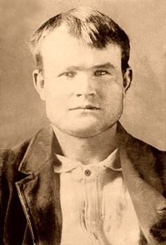
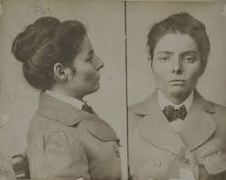
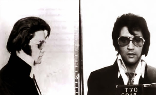
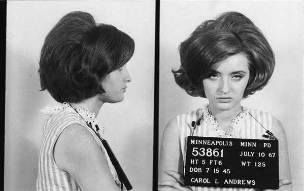
This is the Mugshot Gallery! Welcome! Here are a few of my favorites I have collected and will be adding to, some of these I have already used as references for my concentration pieces. The things that most need to be considered are the postures and how there never completely on center - because these aren't professionals taking the photos- and all of these people aren't at their best moment, they could be miserable about it or they could \be smug - either no expression or an overwhelming amount makes the most memorable ones.
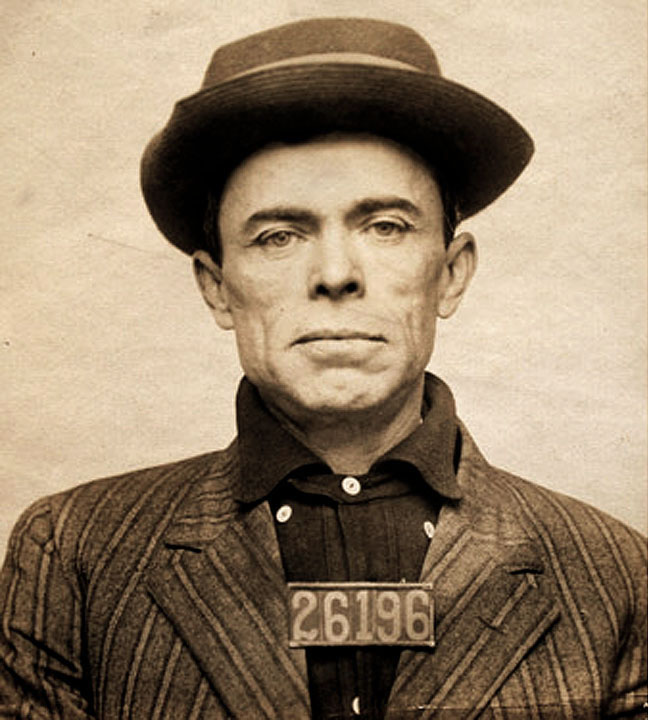
One of my favorite mugshots is the one of Elvis Presley after he was arrested for "holding up" a doughnut shop. One of the funniest things about that mugshot is how depressed and confused he looks and it's all because of a doughnut.
One of my favorite mugshots is the one of Elvis Presley after he was arrested for "holding up" a doughnut shop. One of the funniest things about that mugshot is how depressed and confused he looks and it's all because of a doughnut.